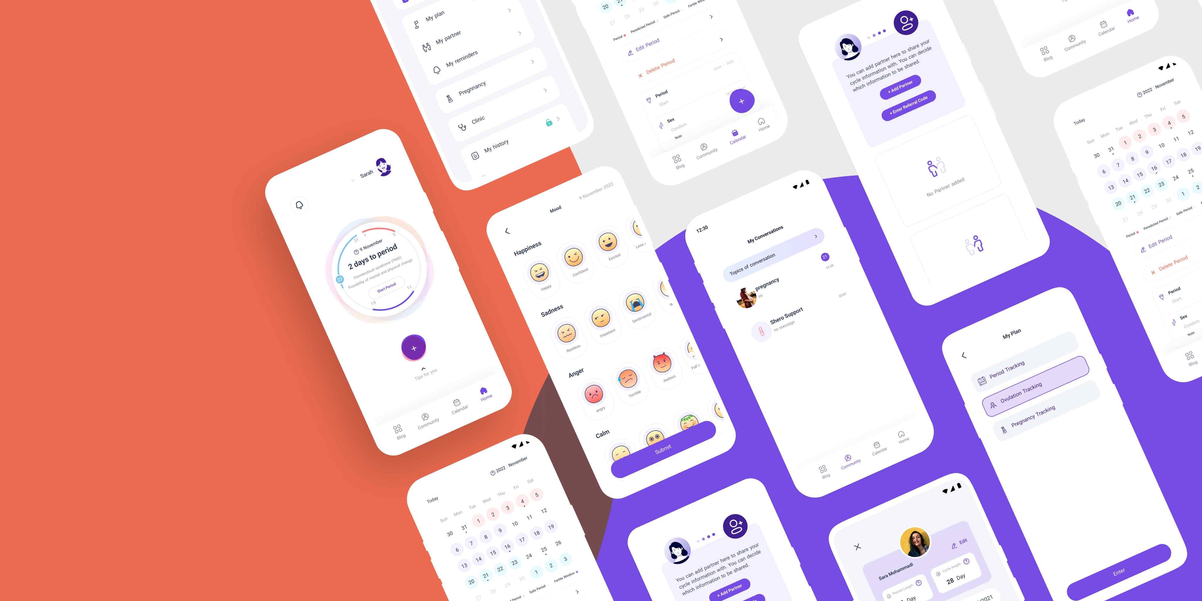
Project Overview:
Shero is a smart and simple calendar app designed specifically for women's health. The app aims to help women track their menstrual cycles, symptoms, and health-related appointments, and provides a variety of features to make managing their health easier and more convenient.
The challenge
Although half of the world’s population is composed of women, only a small fraction of the tech market is dedicated to women’s health needs. Historically, gender bias has led women to being restricted in their access to education and health care, leading to potential health risks and suboptimal health behaviors for women. Over the past few years, the tech industry has taken revolutionary steps to balance out these gender disparities.
Research
was completed as the initial phase to understand and define the users - what they want to see and what would aid in their own health journey, potential pain points, and features they hope and wish for. I needed to understand the user needs in order to build the foundation for the design and to know what to design for.
Research Objectives:
- Pain points: identifying pain points users may currently experience with tracking their health and solutions to aid in resolving or minimizing those pain points
- Features: learning what features users want to actually use and the insights they want to see when it comes to tracking their health
Teams:
- Scope: End to End Product Design, Branding, UX Research
- Role: Senior Product Designer
- Team: 1 product manager, 1 product owner, 4 development team members
Competitive Analysis
Although there are only a select amount of popular period trackers on the market, competitive analysis offered valuable insight into features that existing trackers have integrated, what they are currently offering that users enjoy, and pain points users identify. I completed competitive analysis with the most popular period trackers offered in the app store. I identified what is currently done well, what users identify as useful, and what gaps I could potentially fill with the design of Shero.
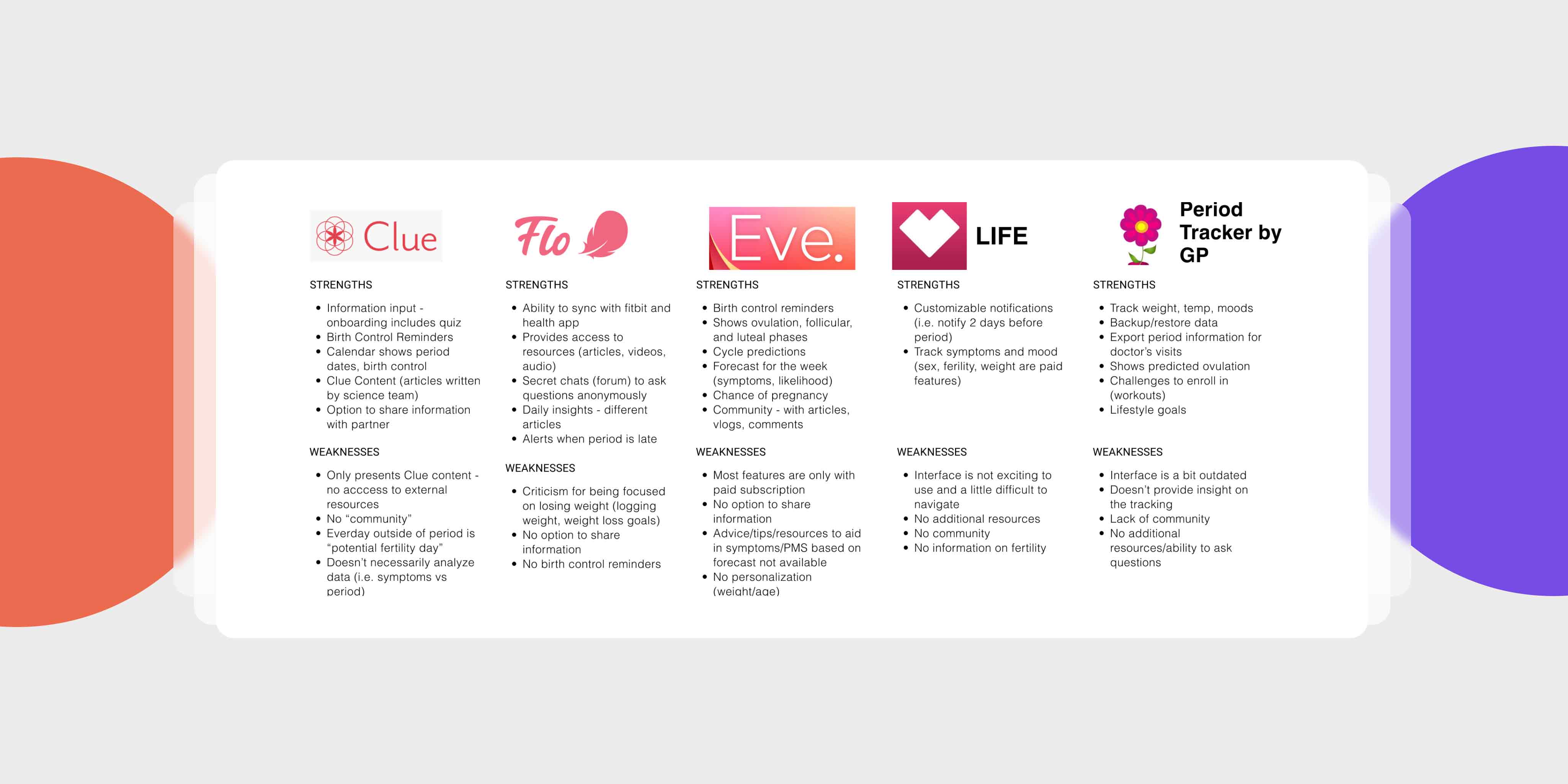
After reviewing some direct competitors and what is currently on the market, I believe these are some of the focuses for designing a period tracking app:
- Options for Input: Users should be able to document a multitude of information as they wish (period dates, symptoms, mental health, workouts, etc.)
- Forecast + Aid: Forecast of symptoms is helpful and Need additional resources on how to aid/deal with the symptoms
- Share and Community: Users should be able to share information as they wish (destigmatize discussions on women’s health), Community is important - forums and questions allows users to have important conversations
- Personalization: Users should be able to enter their information for the most accurate forecasts
User Interviews
After gaining an understanding of what period trackers currently have to offer, I moved onto user interviews where I was able to dive into personal experiences and concerns, wishes, and ask more insightful questions into what users have faced with their reproductive health.
Summary:
- five (5) participants were interviewed on their reproductive health and experiences with health tech
- Open-ended questioning
- Five (5) females
- Ages 24 : 28
- Duration: 15 to 20 minutes
In general, all participants are looking for a simple to use period tracker to track their periods and coinciding symptoms, along with access to reliable evidence based education on female reproductive health A few key takeaways I gathered that I would need to address/implement into the site include:
- Needs: All participants noted they would only use a period tracker if it predicted their periods accurately
- Needs: Users recommendations on what the information means (tracking flow, symptoms vs. their time of the month)
- Frustration: All participants expressed frustrations with no t receiving sufficient education on female reproductive health throughout their life
- Frustration: Difficulty conducting their own research their Google and facing too many results
- Motivation: Wanting to learn more about female reproductive health concepts including fertility, contraceptives, ovulation, etc.
- Motivation: More sense of community and an open space to talk about health and experiences
EMPATHIZE
User Persona
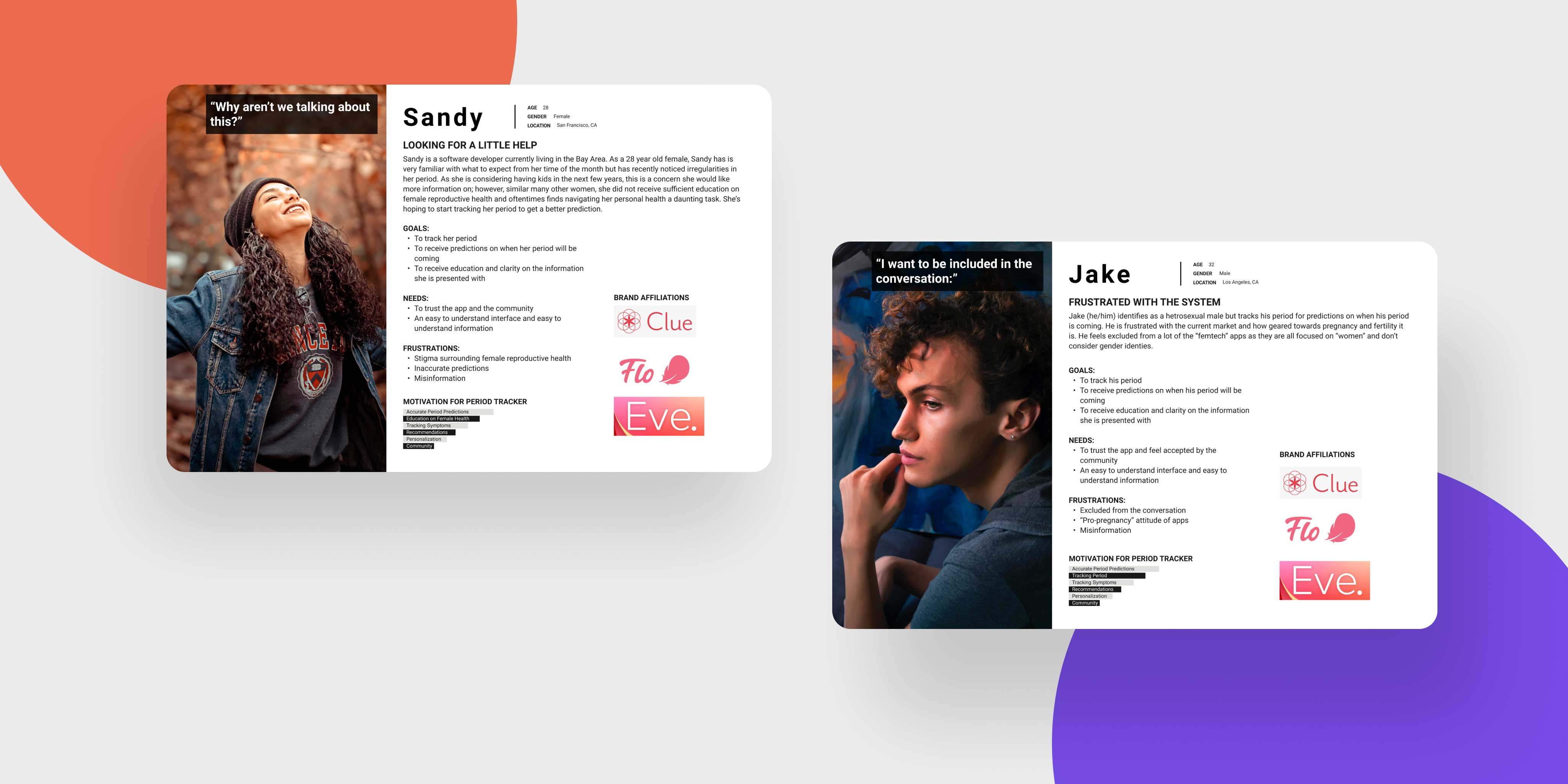
From the gathered information, I was able to create and define two (2) user persona to represent key user findings. I created multiple personas as a reminder for myself to incorporate inclusivity in design and continually think about how differing uses may feel while using the app. Meet Sandy and Jake, both seeking information and control over their reproductive health.
DEFINE
Product Roadmap
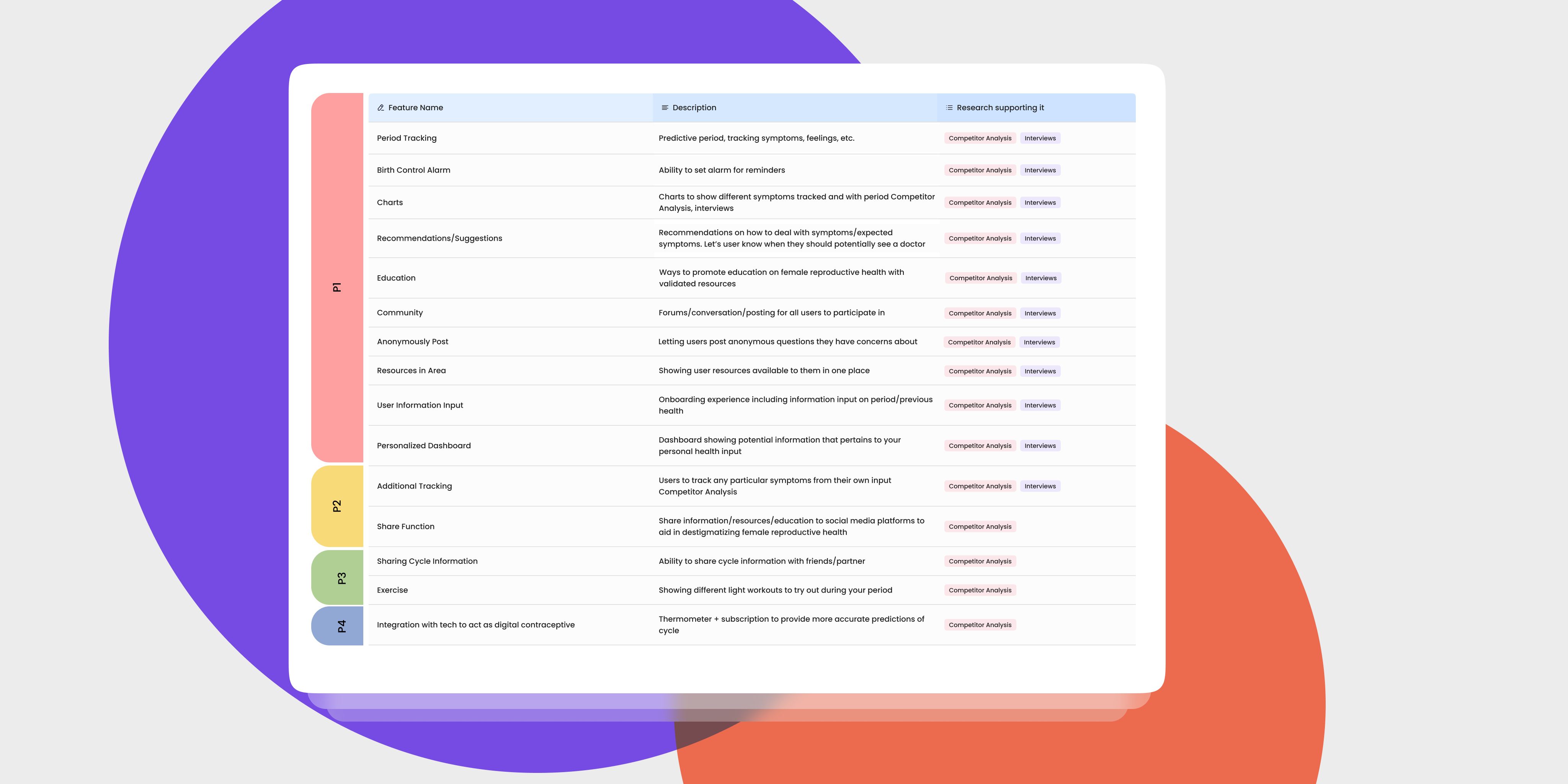
With a female healthcare app, there is so much potential with what can be done to address the needs of users. I decided to brainstorm potential features prioritize them based on user needs identified during the research phase. I created an extensive feature roadmap and ranked each feature by Must-have (P1), Nice-to-Have (P2), Surprising and Delightful (P3), and Can-come-later (P4).
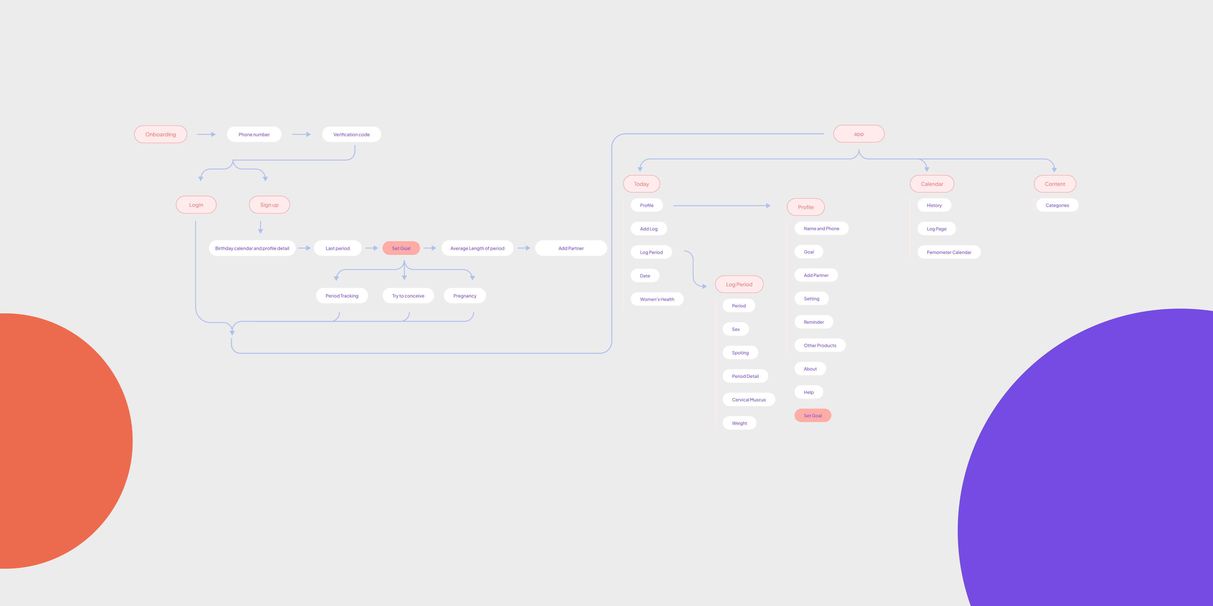
User Flow For a more comprehensive look into the site needs, I created user flows based on the MVP Shero needed to achieve:
- Log period and symptoms
- Access to browse and search for educational resources
- Ask questions and browse forums
The user flow was used to help me determine what functions and pages I would need to be designing for, for the user to complete their tasks.
IDEATE
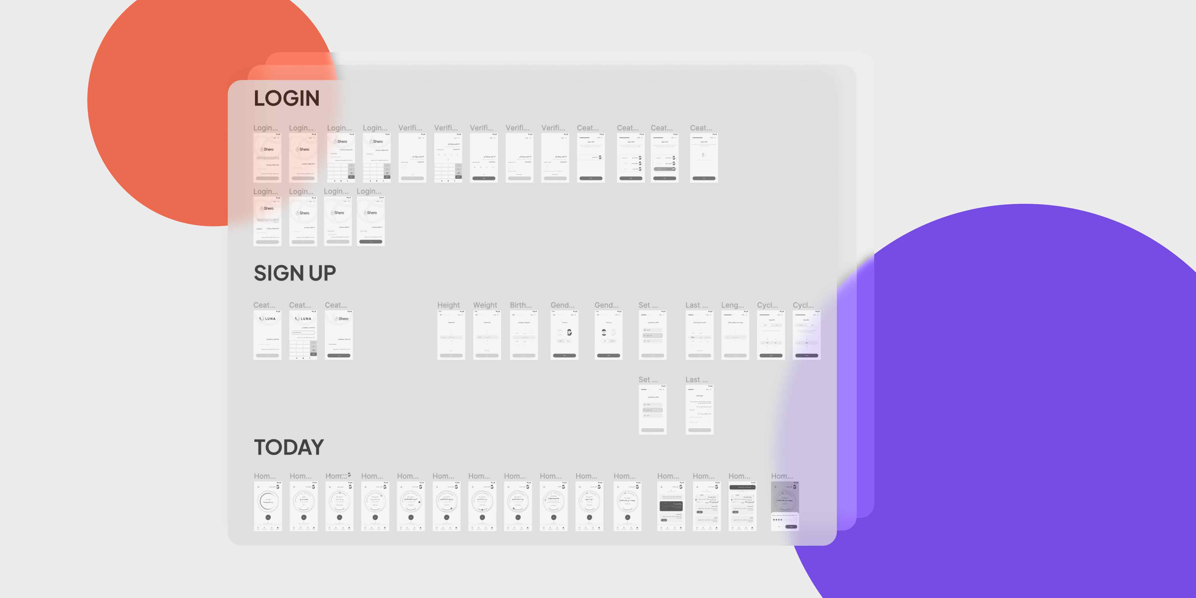
Wireframes
I began the wireframe process with hand drawn sketches with rough layout ideas to ensure I was clear on the vision I had for the design. I digitized my wireframes focusing on UI requirements, hierarchy, and layout.
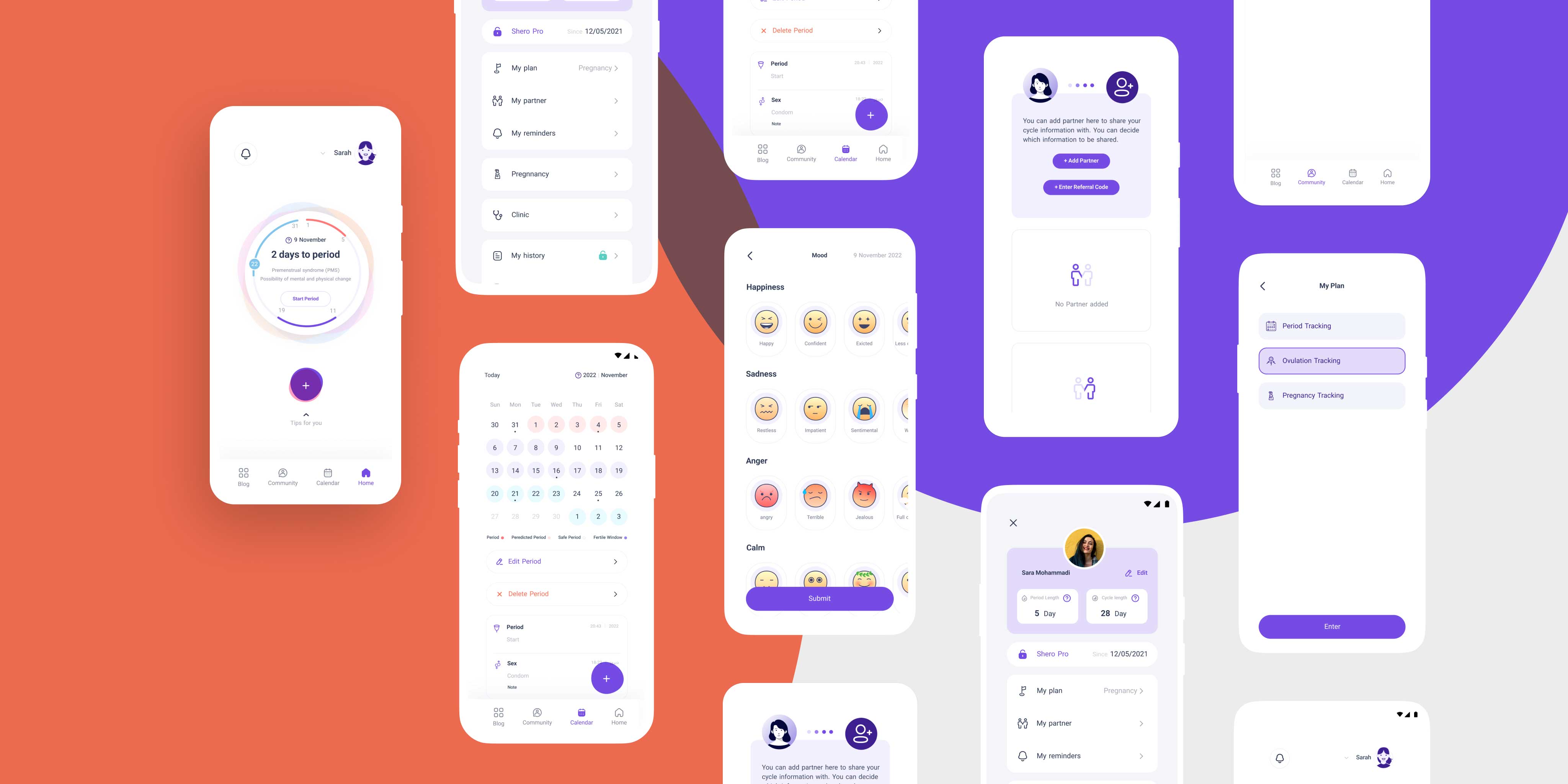
UI Designs
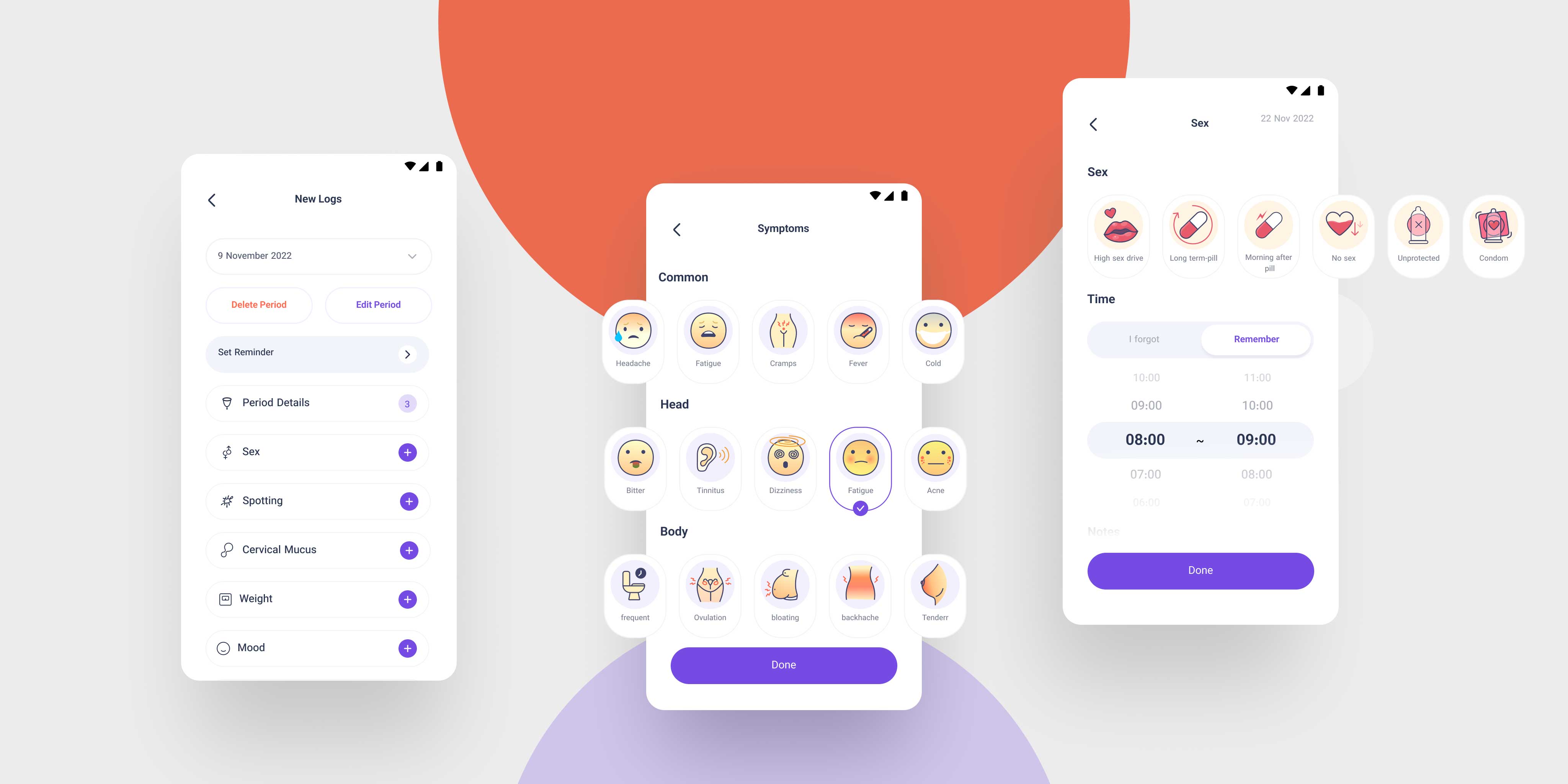
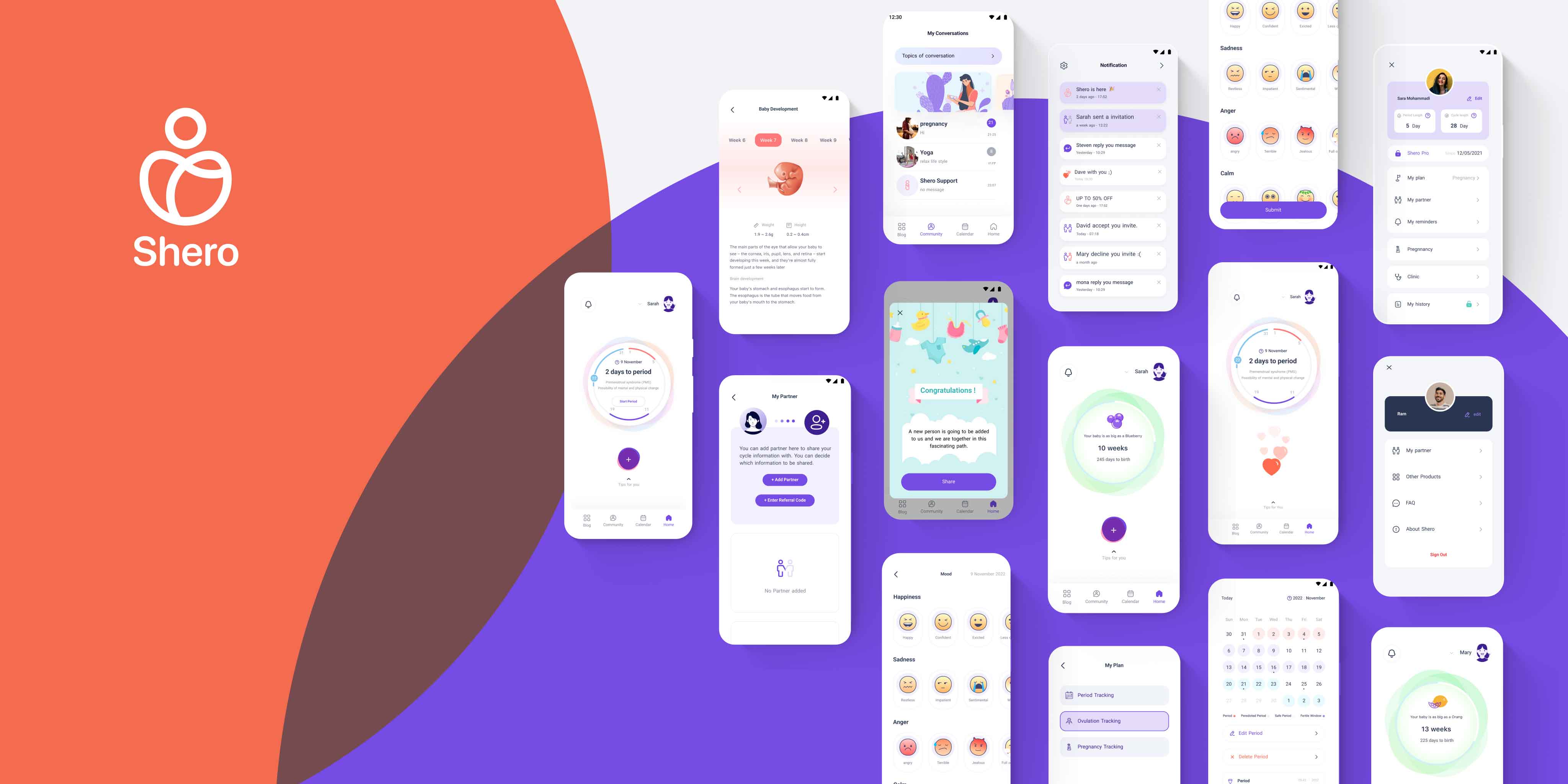
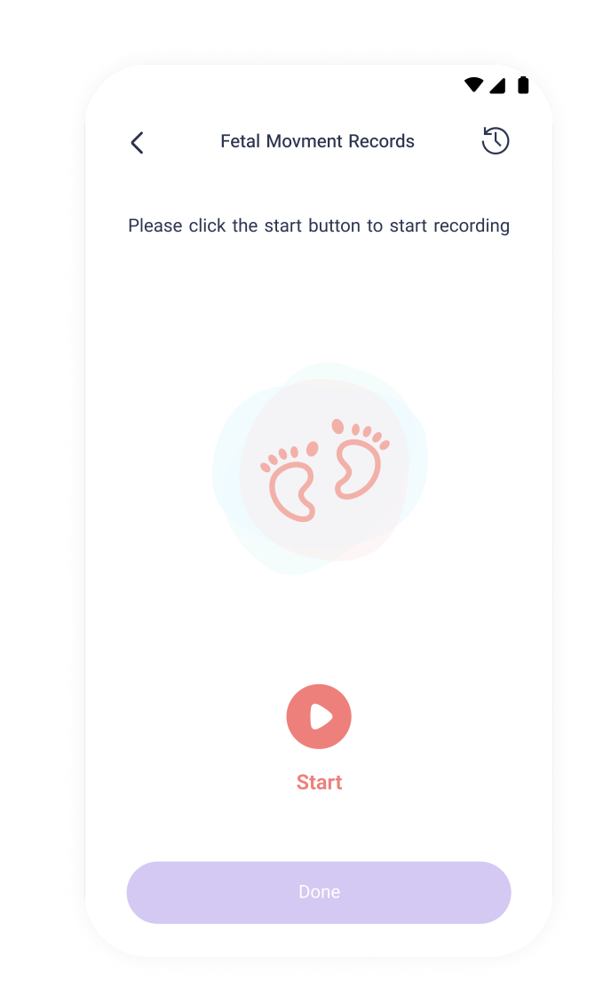
Below showcases the UI designs I created for Shero based off of the research, branding, and information collected, while adhering to visual hierarchy rules and Nielsan Norman Heuristics.
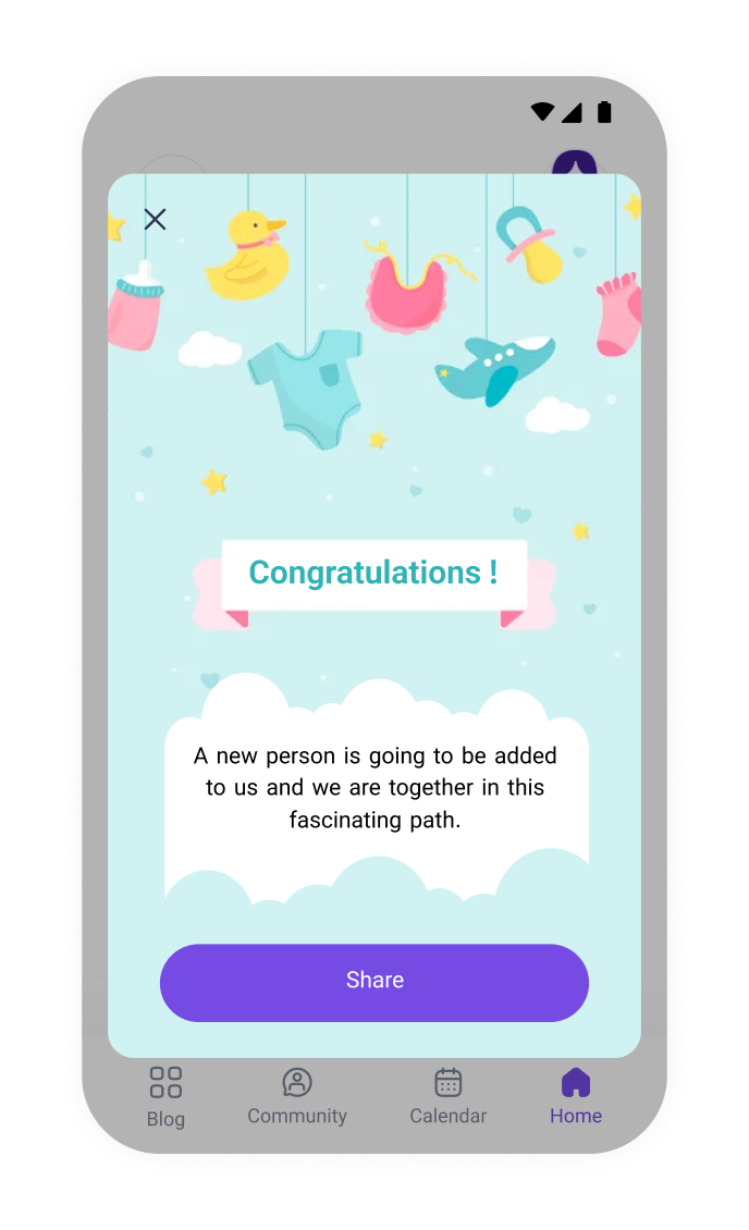
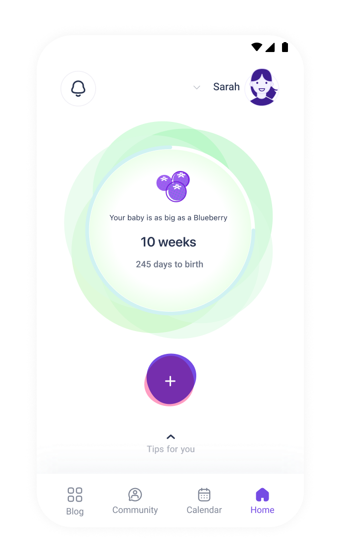
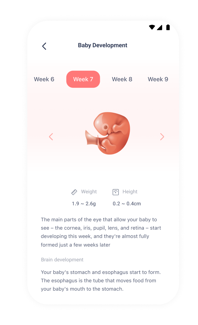
Pregnancy mode Shero will either automatically calculate how far along you are based on your last period, or ask you to select the number of weeks manually, in case you have no previously logged periods.
PROTOTYPE
Delivering the Prototype
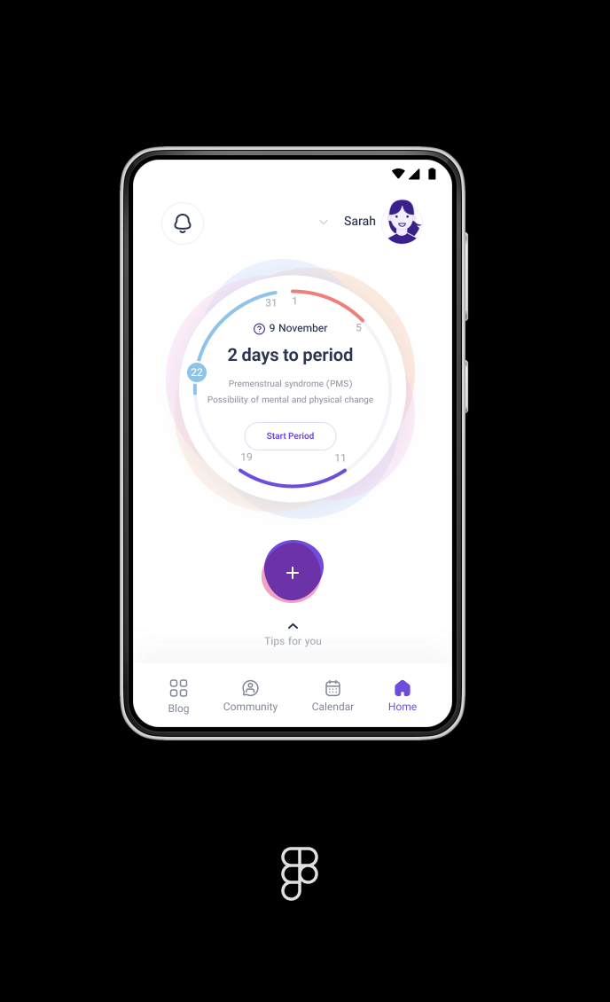
After pulling together the research, information architecture, and branding to form the responsive UI designs, I needed to test my design to understand how those with a fresh look would navigate the site.
For the prototype I created it based on the primary tasks for my MVP:
View Prototype Here
TESTING
Usability Testing
Usability testing allowed for me to ask real people to complete the different tasks I set out and to identify any pain points or feedback. To prepare for usability testing, I prepared a usability testing plan (including the test objectives, methodology, participant summary, tasks, and script). I decided to test with the primary audience (females) with one male user test to understand how someone with less knowledge of female reproductive health would navigate the app.
- Scenario 1 - Log Period and Symptoms, View History, Check Cycle Summary
- Scenario 2 - View Education Dashboard, Search for Information on Menstrual Cups
- Scenario 3 - Post a Forum Question on Period Cramps
Participant Summary:
- Participant 1) Female, 25, Pharmacist
- Participant 2) Female, 25, Software Developer
- Participant 3) Male, 27, Pharmacist
- Participant 4) Female 24, Medical Student
- Participant 5) Female, 26, Civil Engineer
Affinity Map
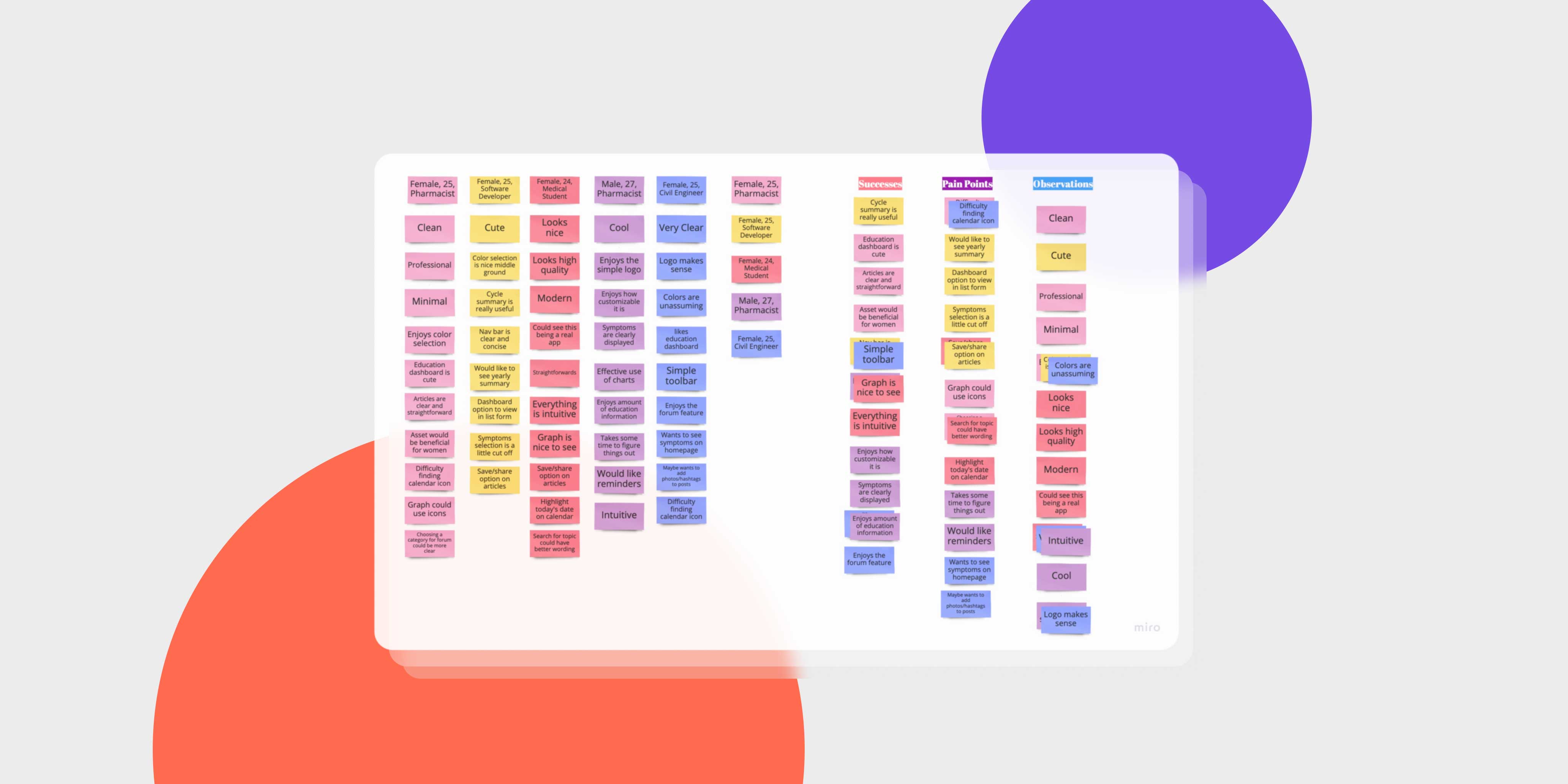
To better summarize and visually view the findings from the usability testing, I created an affinity map. I used this tool to identify common pain points/frustrations and successes and from there, determined priority revisions from those findings.
Key Findings and Priority Revisions
From the usability testing and affinity map, I was able to note the following key findings.
Pain Points:
- 20% of Participants had difficulty finding the calendar icon to view their previous logged symptoms
- 20% of Participants had difficulty understanding the topic selection for the forums
- 20% of Participants mentioned wanting a share/save button for the educational articles
Successes:
- Primarily All Participants had 100% Success Rate
- 100% of Participants mentioned enjoying the visual design, colour selection, and overall branding of Shero
- 60% Participants mentioned app being nicer than apps they have seen previously
I focused on what users noted as pain points and thought of potential updates I could make to the design.
- Calendar Icon - the calendar icon was separate from the primary nav bar but was separated from the calendar/date scroll. I decided to remove the section divider and put the "view calendar" text next to the dates shown to organize similar components closer together.
- Topic Selection - I added additional description to the topic selection to allow the user to better understand that a category/topic needs to be selected to post a question.
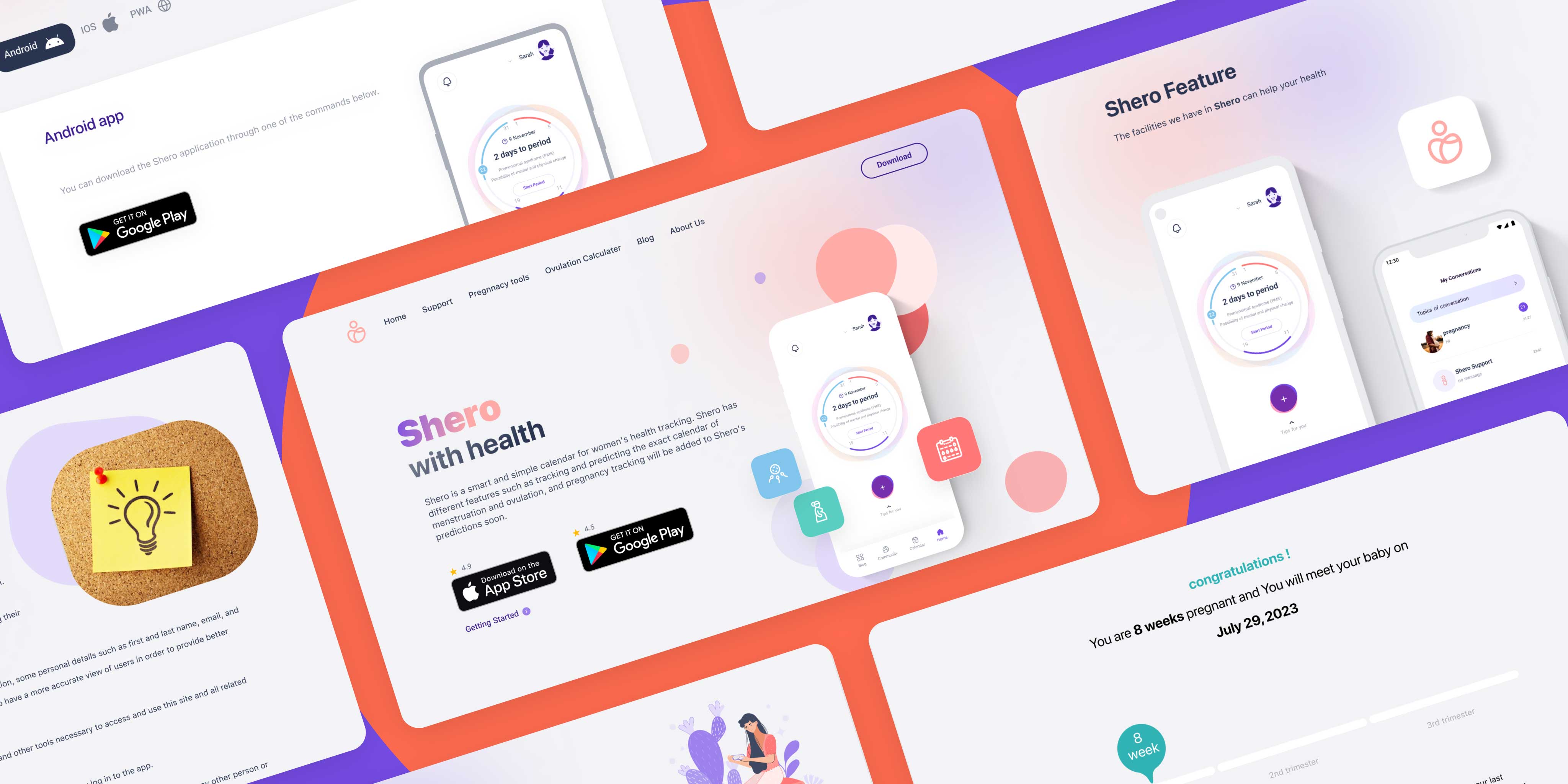
DESIGNSYSTEM WEBSITE
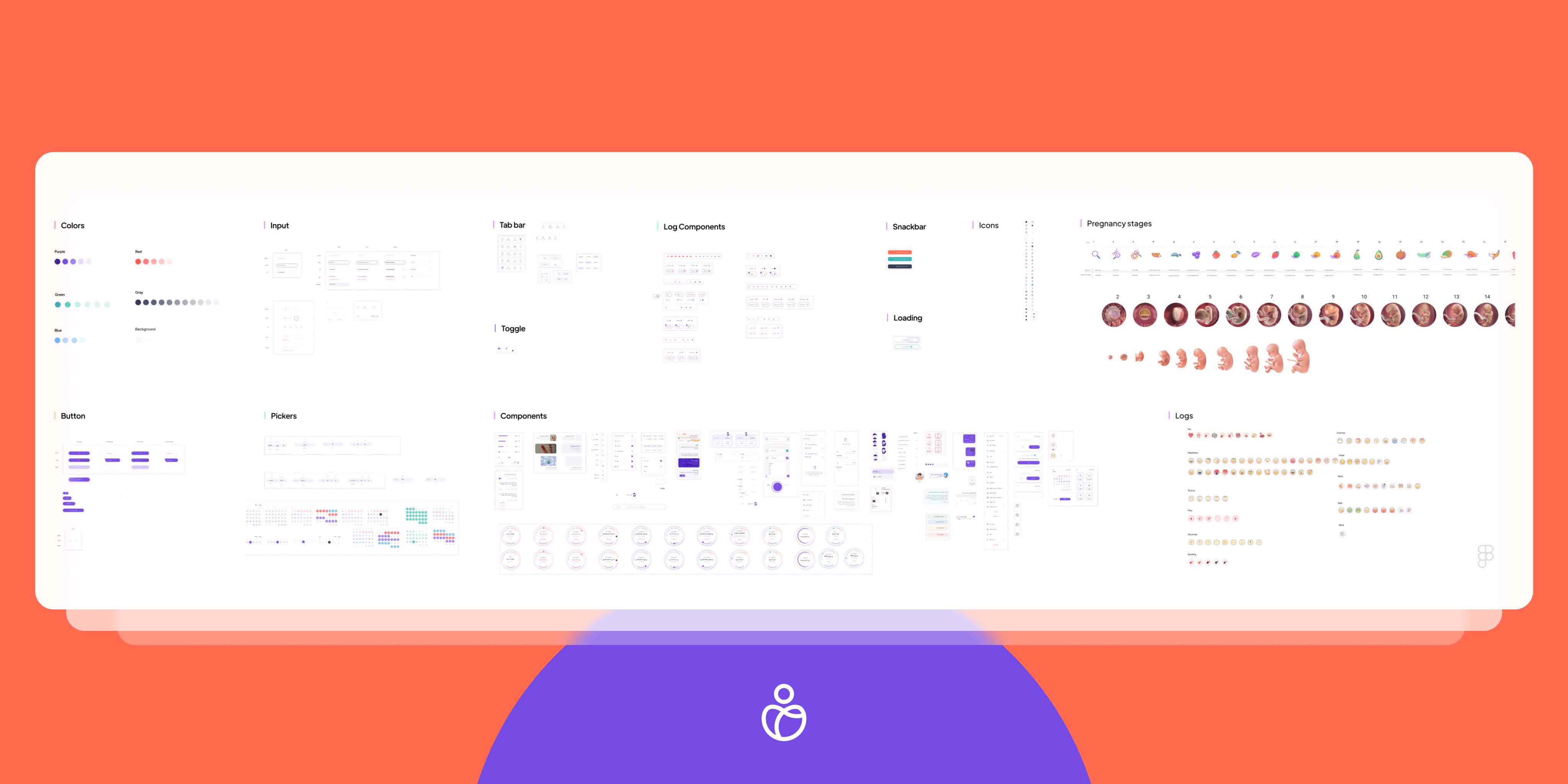
DESIGN SYSTEM
I created the design system Tile based on inspiration and branding of Shero to act as a guide, including the all component and style design, brand colors, typography, and imagery. I continually referred back to this style tile while completing the responsive designs to ensure the design was cohesive and consistent.
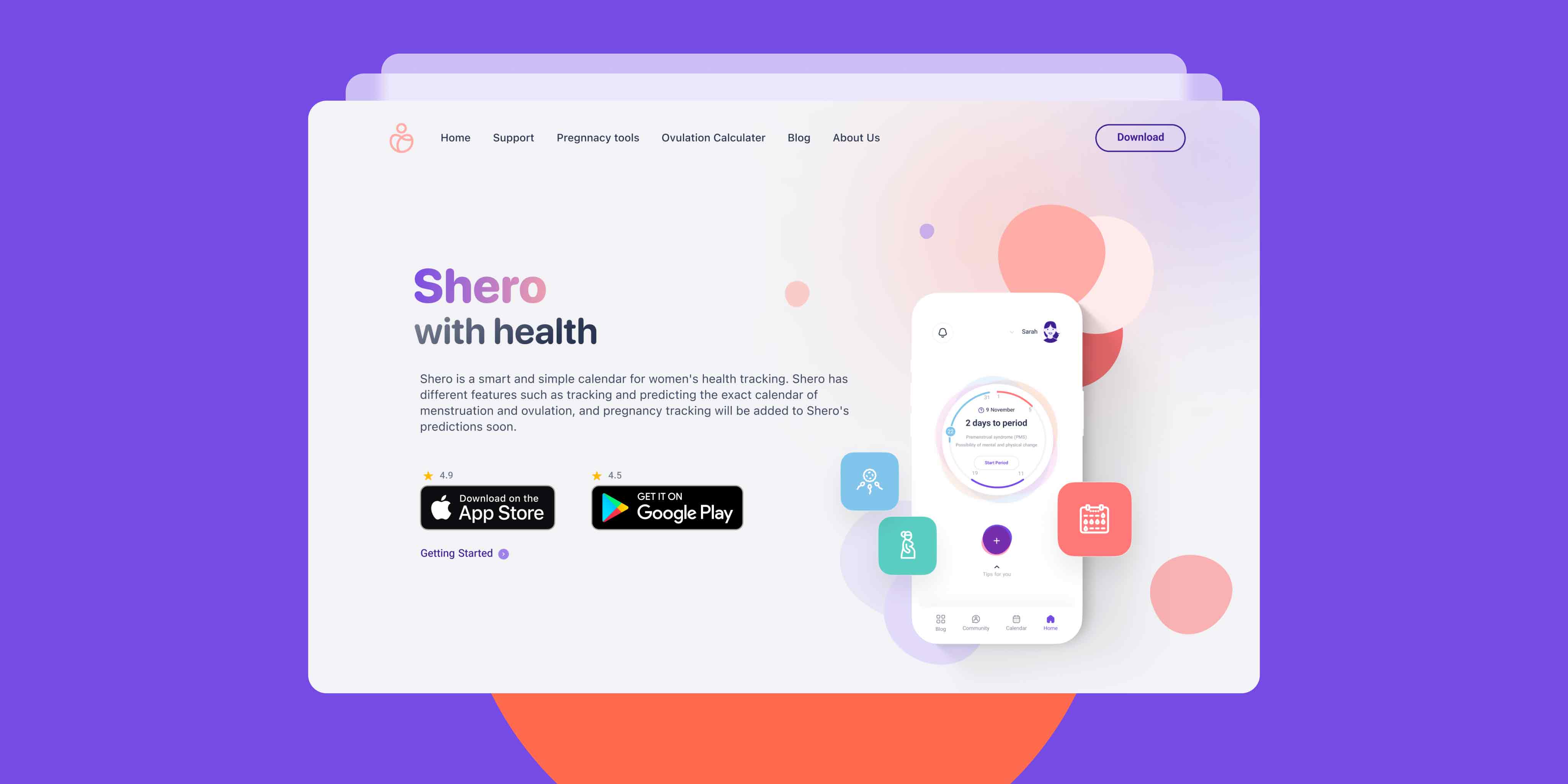
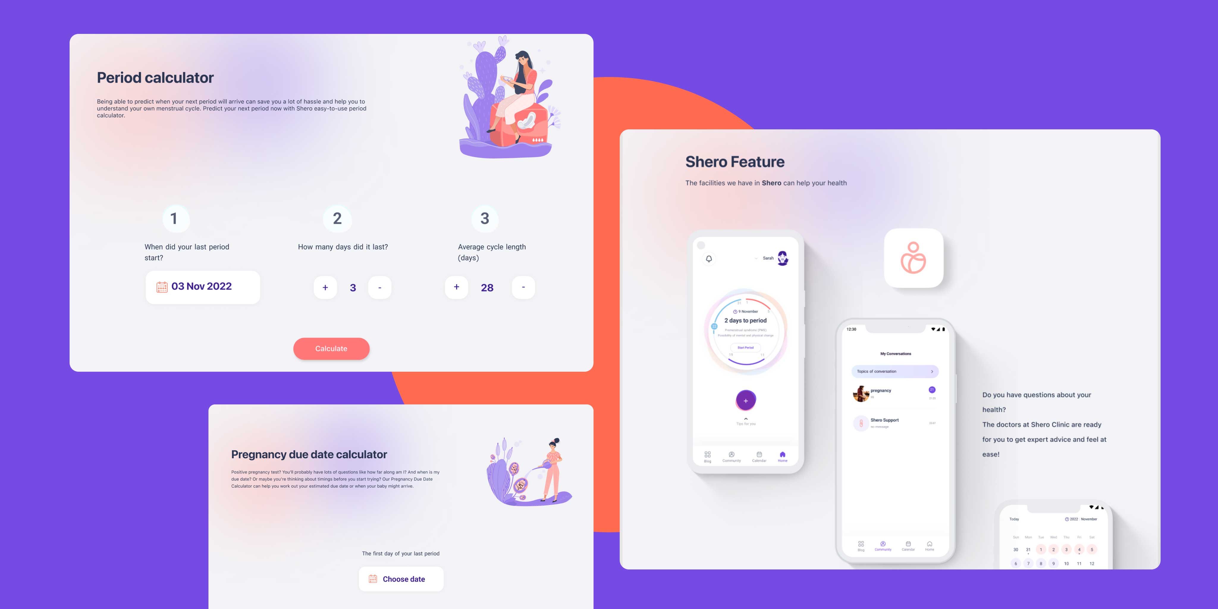
WEBSITE
REFLECTION
Final Thoughts
Designing an entire app was both an exciting and challenging process. I had the creative freedom to provide solutions to real issues that I am personally passionate about. Researching female health, current female tech, and listening to real stories from women that have struggled with their reproductive health was both eye-opening and truly highlighted real gaps in female health education and resources available. Being able to design an app that has the potential to benefit users in better understanding their health and aid in their health journey was a fulfilling experience.
There are so many additional features I would like to implement into this app if I had more time - including more tech integration (similar to a tech birth control), smart tampons in the future, onboarding pages, export of information, etc. I believe there is a lot more to explore in the world of femtech and so many more ways that design can be used to benefit women everywhere.
 Universe Collection